Font Pairing
72 hand-picked Google Font pairs: pick a heading font, get body fonts that fit, press Space for the next pair, lock one font, type your own words and preview the pair as an article, a card, a poster or a web page.
Playfair Display (Serif) + Source Sans 3 (Sans-serif) · Classic, Editorial
Make something people remember
Good typography is invisible until it is missing. Pick a heading font, pair it with a body font, and read a whole paragraph before you decide.
High-contrast serif headlines over a neutral, open sans: the magazine formula that reads well at any size.
Share: link to this pair, brand sheet image
Advanced: sizes, line height, letter spacing, the CSS
Your text stays on your device. Fonts are loaded from Google Fonts by family name and weight only; the headline and paragraph you type are never put in a request, a URL or analytics. Saved pairs, your text and settings live in this browser's local storage. The share link carries the two font names and the tab.
How to pair fonts
Pick a heading font, press Space for the next curated pair, lock what you like and copy the CSS: three steps, no sign-up, and a pair is already on screen when the page opens.
- Pick a heading font from the list, or keep the one on screen: a pair with a sample headline and paragraph is already showing when the page opens. The chips under the picker suggest 3–5 body fonts that go with it; tap one to try it.
- Press Next pair or the Space bar for the next curated combination; filter by style (Classic, Modern, Friendly, Elegant, Bold, Editorial, Playful) to stay in one mood. Lock the heading or the body font to keep it while the other changes, and use Previous to go back.
- Type your own headline and paragraph, switch the preview between Article, Card, Poster, Web page, Brand, and adjust sizes under Advanced. Press Copy CSS to get the Google Fonts link tag and the font-family rules, Open in Google Fonts for both specimen pages, or Save pair to keep it for later.
Font pairing rules that work
Four rules cover most good font combinations, and every pair on this page follows at least one of them:
- Contrast: pair a serif with a sans-serif (or a script with a plain sans) so the heading and the body are clearly different jobs; two similar fonts look like a mistake.
- One family, two weights: Bold for headings and Regular for text from the same family can never clash; Montserrat, Inter and Red Hat Display are in the list this way.
- Match x-height: fonts whose lowercase letters are a similar height (Merriweather and Open Sans, Lora and Nunito Sans) sit at the same visual size, so the page feels even.
- Limit to two fonts: one for headings, one for body; a third font is only for a small accent (a date on an invitation, a label) and should be used once.
Colors next? The random color generator gives a palette with locks the same way, and the lorem ipsum generator fills a mock-up with dummy text to read the pair at length.
Best Google Font pairings
These are the 72 curated pairs in the tool, grouped by style, each with the reason it works: open a style to see its pairs, and a pair to try it with your own text.
Classic (12 pairs: serif headings with a plain sans body, the book-and-magazine formula)
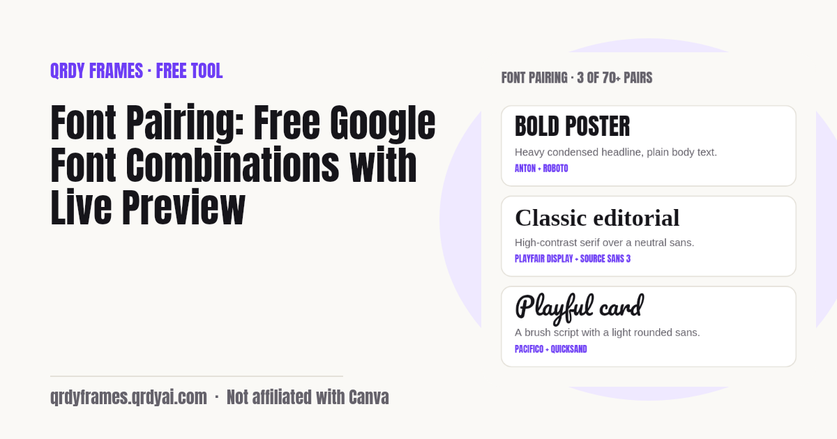
- Playfair Display + Source Sans 3Classic, Editorial · High-contrast serif headlines over a neutral, open sans: the magazine formula that reads well at any size.
- Playfair Display + LatoClassic, Elegant · Lato's round, warm shapes soften Playfair's sharp contrast without competing with it.
- Libre Baskerville + Source Sans 3Classic, Editorial · A classic book serif with a plain sans: the serif brings tradition, the sans keeps long text clear on screens.
- Merriweather + Open SansClassic, Friendly · Both were drawn for screens with large x-heights, so the serif and the sans sit at the same visual weight.
- EB Garamond + Work SansClassic, Editorial · A Renaissance text face for titles, a grotesque with similar proportions for everything else: old meets new without a clash.
- Crimson Pro + Public SansClassic, Editorial · A book serif with a government-grade sans: the pairing feels trustworthy and stays readable at small sizes.
- Old Standard TT + Source Sans 3Classic, Editorial · A 19th-century scholarly serif made modern by a clean, unobtrusive sans.
- Libre Caslon Text + Libre FranklinClassic, Editorial · The two Libre faces revive classic American typefaces, so the serif and the sans share the same era and tone.
- Alegreya + Alegreya SansClassic, Friendly · One superfamily in two forms: identical proportions and rhythm, maximum harmony with a visible contrast.
- Vollkorn + Fira SansClassic, Friendly · Vollkorn's sturdy serifs and Fira Sans's humanist shapes both feel solid and open at text sizes.
- Domine + Open SansClassic, Friendly · Domine was made for headlines on screens, and Open Sans is the body text half the web already trusts.
- Bitter + RalewayClassic, Modern · Bitter's screen-friendly slab for titles with Raleway's elegant thin sans: sturdy meets refined.
Modern (19 pairs: geometric or grotesque sans fonts, clean and neutral)
- Playfair Display + InterModern, Editorial · A modern interface sans keeps the body quiet, so Playfair carries all the personality.
- DM Serif Display + DM SansModern, Elegant · Drawn as one family: the serif display and the sans text share proportions, so they fit like matching bookends.
- Roboto Slab + RobotoModern, Friendly · Same skeleton, different serifs: the slab gives headings presence and the sans keeps paragraphs light.
- Zilla Slab + MulishModern, Friendly · Zilla's compact slab and Mulish's minimalist sans are both low-contrast, so they sit at one visual weight.
- Montserrat + MerriweatherModern, Editorial · A geometric sans for headings with a readable serif for body text: the reverse of the classic formula, still high contrast.
- Work Sans + Source Serif 4Modern, Editorial · A plain grotesque for headings and a contemporary serif for text, both drawn for screens at the same size.
- Poppins + PT SerifModern, Friendly · Poppins's round geometric letters stay bold and modern, while PT Serif makes the body text feel considered.
- Archivo + MerriweatherModern, Editorial · A grotesque made for headlines with a serif made for reading: the two jobs stay separate.
- Syne + SpectralModern, Editorial · Syne's wide, art-school letters and Spectral's crisp serif give an editorial page a contemporary edge.
- Montserrat + MontserratModern, Bold · One family, two weights: Bold headings and Regular text share every curve, so nothing can clash.
- Inter + InterModern · Inter Bold over Inter Regular is the safest interface pairing: a single family with a clear size and weight step.
- Space Grotesk + InterModern, Bold · Space Grotesk's quirky curves make headings memorable; Inter's neutral body keeps the page clean.
- Plus Jakarta Sans + Open SansModern, Friendly · Two humanist sans fonts with different flavours: Jakarta's modern shapes lead, Open Sans stays invisible.
- Sora + ManropeModern · Two geometric sans faces: Sora's wide letters read as tech, Manrope as a balanced body for product pages.
- Outfit + LexendModern, Friendly · Outfit's clean geometry for titles and Lexend's wide, legibility-tested shapes for body text.
- Red Hat Display + Red Hat DisplayModern, Friendly · A display family in two weights: Bold for headings, Regular for shorter body text, zero mismatch.
- Space Mono + Work SansModern, Playful · A quirky monospace for headings and a plain grotesque body: tech, portfolios and zines.
- IBM Plex Mono + IBM Plex SansModern · One superfamily: the mono for titles and code, the sans for text, with matching proportions.
- JetBrains Mono + InterModern · A developer monospace for headings with the standard interface sans: documentation and product pages.
Friendly (4 pairs: rounded, open letters that feel warm and approachable)
- Lora + Nunito SansFriendly, Classic · Lora's calligraphic roots and Nunito Sans's rounded terminals share the same gentle rhythm.
- Comfortaa + Nunito SansFriendly, Modern · Rounded geometric display with a rounded humanist body: soft, modern, approachable.
- Caveat + Open SansFriendly, Playful · A casual handwriting face for a personal headline, grounded by the plainest body sans.
- Courgette + NunitoFriendly, Playful · A medium-contrast upright script with a rounded sans: soft, cheerful product and bakery pages.
Elegant (13 pairs: thin, high-contrast serifs and scripts for formal and luxury pages)
- Cormorant Garamond + Proza LibreElegant, Classic · Cormorant's delicate, high-contrast letters stay the star while Proza Libre, a humanist sans, carries the reading.
- Cormorant Garamond + MontserratElegant, Modern · Thin elegant serif against a geometric sans: the contrast in construction makes both clearer.
- Bodoni Moda + FigtreeElegant, Editorial · Bodoni's razor contrast reads as luxury, and Figtree's friendly sans keeps paragraphs from feeling cold.
- Prata + Nunito SansElegant, Classic · Prata's refined Didone shapes make headlines feel formal; Nunito Sans adds a soft, modern body text.
- Yeseva One + Josefin SansElegant, Playful · A curvy, feminine display serif paired with a geometric vintage sans: a boutique, wedding-card look.
- Cinzel + RalewayElegant, Classic · Roman inscription capitals for titles and a thin elegant sans for body: formal, timeless, clear.
- Marcellus + LatoElegant, Classic · Marcellus's inscriptional elegance over Lato's plain warmth is a quiet, luxurious combination.
- Raleway + LoraElegant, Modern · Raleway's thin, elegant capitals paired with Lora's warm serif read like a well-designed lifestyle blog.
- Josefin Sans + Crimson ProElegant, Playful · A geometric art-deco sans against a soft book serif: vintage but easy to read.
- Dancing Script + LoraElegant, Playful · A lively calligraphic script over a warm serif body: invitations, greeting cards and recipe pages.
- Great Vibes + Cormorant GaramondElegant, Classic · A formal flourished script with a light classic serif: the wedding-invitation pairing.
- Sacramento + RalewayElegant, Playful · A thin monoline script and a thin elegant sans share the same light stroke, so the page feels airy.
- Parisienne + Libre BaskervilleElegant, Classic · An elegant French script with a classic book serif: menus, invitations and anything formal.
Bold (11 pairs: heavy condensed or slab headlines for posters and banners)
- Abril Fatface + LatoBold, Editorial · A fat, high-contrast display face for big headlines with a neutral sans that gives the eye a rest.
- Arvo + LatoBold, Friendly · A geometric slab serif with a geometric-leaning sans: the slab holds the headline, Lato stays readable below.
- Alfa Slab One + NunitoBold, Playful · A heavy, rounded slab display with a rounded sans: loud but friendly, ideal for posters and kids' brands.
- Oswald + EB GaramondBold, Editorial · Condensed bold headlines with a classic text serif: newspaper contrast, heavy on top and calm below.
- League Spartan + Nunito SansBold, Modern · A heavy geometric display sans with a soft body sans: strong hierarchy from weight alone.
- Unbounded + JostBold, Modern · Unbounded's extended letters make a loud headline, and Jost's Futura-like body keeps the geometry consistent.
- Bebas Neue + Open SansBold, Modern · All-caps condensed headlines with a neutral sans body: the poster pairing that works at any size.
- Anton + RobotoBold, Modern · Anton's heavy condensed impact and Roboto's plain body are a sports-poster classic.
- Archivo Black + ArchivoBold, Modern · One family: the Black cut for headlines and the regular weight for text, so the hierarchy is pure weight.
- Ultra + PT SansBold, Classic · An ultra-heavy slab for one-word headlines, with a sturdy neutral sans that stays out of the way.
- Staatliches + InterBold, Modern · Narrow all-caps display with a neutral interface sans: posters, labels and event banners.
Editorial (1 pairs: pairs built for long reading: articles, newsletters, reports)
- Spectral + KarlaEditorial, Modern · Spectral's crisp serifs and Karla's slightly quirky grotesque are both built for long reads with a bit of character.
Playful (12 pairs: scripts, hand-drawn and cartoon faces for cards, kids and parties)
- Fraunces + ManropePlayful, Editorial · Fraunces's soft, old-style quirks against Manrope's clean geometry give a page personality without noise.
- Righteous + QuicksandPlayful, Bold · A retro rounded display with a soft rounded sans: bold but friendly, good for kids and party cards.
- Fredoka + NunitoPlayful, Friendly · Both are round and bouncy; Fredoka Bold for the title and Nunito for text keep a playful page readable.
- Lilita One + Baloo 2Playful, Bold · Chunky cartoon headline with a chunky but readable body: a toy-shop, party and school look.
- Bangers + CabinPlayful, Bold · Comic-book shout for the title, a plain humanist sans for the caption: loud top, quiet bottom.
- Shrikhand + Work SansPlayful, Bold · A fat italic display with lots of swagger, calmed by a plain grotesque body.
- Amatic SC + Josefin SansPlayful, Friendly · Hand-drawn narrow capitals with a geometric vintage sans: cafe menus and chalkboard signs.
- Pacifico + QuicksandPlayful, Friendly · A surf-shop brush script for short headlines with a light rounded sans that keeps the body relaxed.
- Lobster + CabinPlayful, Bold · A bold connected script for titles, a humanist sans for everything else: diner-sign charm with readable text.
- Satisfy + LatoPlayful, Friendly · A relaxed brush script with a warm, neutral sans: signage, cafes and casual invitations.
- Permanent Marker + KarlaPlayful, Bold · Marker-pen headlines with a slightly quirky grotesque: street-style posters that stay legible.
- Kaushan Script + MulishPlayful, Bold · A brush script with energy for the title, and a minimal sans that lets it breathe.
Every family is on Google Fonts (for example Playfair Display) under the SIL Open Font License or Apache 2.0. Looking for this page by another name? /tools/font-combinations and /tools/google-font-pairings both open it.
Font combinations for cards, posters and websites
The best font combination depends on what you are making: cards want elegance or play, posters want weight, and websites want neutral body text that reads at 16 px. Use the Card, Poster and Web page previews on this tool to see the same pair in each setting before you decide.
- Cards and invitations: Elegant and Playful pairs: a script or a high-contrast serif for the name or the headline (Great Vibes + Cormorant Garamond, Dancing Script + Lora, Yeseva One + Josefin Sans), set large, with a short sans or serif line for the details.
- Posters and banners: Bold pairs: condensed or heavy display faces (Bebas Neue + Open Sans, Anton + Roboto, Abril Fatface + Lato) that stay readable from across a room, with the body font only for the fine print.
- Websites and apps: Modern and Editorial pairs: a neutral sans body (Inter, Source Sans 3, Open Sans, Work Sans) with a heading font that carries the brand (Playfair Display, Space Grotesk, DM Serif Display); keep body text at 16–18 px and line height around 1.5.
- Articles, newsletters and reports: Classic and Editorial pairs: a book serif or a screen serif for either role (Merriweather + Open Sans, Libre Baskerville + Source Sans 3, Spectral + Karla), which stay comfortable over thousands of words.
Making the headline in Canva? Text to Frames, our Canva app, turns a word set in a Google font into a photo frame inside your design: try Text to Frames in Canva See it on the web first on the Text to Frames page or a topic page: Letter Frames for Canva, Number Frames for Canva, Script Text Frames for Canva.
Pick brand fonts for your small business
Pick brand fonts by seeing your own business name in each pair on the things customers actually see: choose the Brand preview, type the name and an optional tagline, and every pair shows up as a logo, a business card, a square Instagram post and a short menu or price list.
Stuck between two or three? Add them to Compare and press Ask friends to pick: friends get a numbered “Which one?” link (and a card image on phones), tap 1, 2 or 3 and send their pick back as a short link; opening those replies on your device counts the votes. Then press Set as my brand fonts and the tool opens on your kit next time, with a kit card and the exact font names to search in Canva's font menu for every new flyer.
- See your name: the Brand preview sets your business name and tagline as a logo lockup, a business card, an Instagram post and a 3-line menu; on Compare each pair shows as a logo.
- Ask friends to vote: one link with the options numbered 1–3; no account, nothing stored on a server, and the name travels only after the # in the link.
- Keep the winner: your brand kit (pair, name, tagline, sizes, up to 3 colours) stays in this browser, with a 1080 × 1350 kit card and Copy font names.
Brand colours next? The random color generator suggests palettes; paste up to three hex codes into your brand kit on the Saved tab.
Is my text uploaded?
No: the headline and paragraph you type stay in this browser. The only network requests are the Google Fonts stylesheets for the fonts on screen, and those carry family names and weights from our list, never your words (the tool deliberately does not use the text= parameter). Your text, template, style filter, sizes, last pair, compare set and saved pairs live in this browser's local storage under one key (qrdy.fontpair.v1); analytics record only a pair id from our list, the template, the style and counts. If your browser blocks storage, the tool still works and tells you that pairs will not be kept.
Font pairing FAQ
Is the font pairing tool free?
Yes, completely: no account, no sign-up, no limit on pairs, previews or saved pairs. It is one of the free tools made by the team behind Qrdy Frames, and every font in it is a free Google Font.
What is font pairing?
Font pairing is choosing two typefaces that work together, usually one for headings and one for body text. A good pair has clear contrast (serif with sans-serif, heavy with light) but similar proportions, so the page looks intentional and stays easy to read. This tool shows curated pairs with a live preview so you can judge the combination in context rather than from two font names.
What are good Google Font pairings?
Reliable Google Font pairings include Playfair Display with Source Sans 3, Merriweather with Open Sans, Montserrat with Merriweather, Lora with Nunito Sans, Bebas Neue with Open Sans, DM Serif Display with DM Sans, and Oswald with EB Garamond. The list on this page has 72 such pairs grouped by style (Classic, Modern, Friendly, Elegant, Bold, Editorial, Playful), each with one line on why it works.
Can I lock one font?
Yes. Press Lock on the heading or the body font and it stays while Next pair (or Space) changes the other one: with the heading locked you cycle through body fonts that suit it, with the body locked you cycle through heading fonts that go with it. Lock both and nothing changes until you unlock one; Previous steps back through what you saw.
Can I type my own text?
Yes. Edit the headline (up to 80 characters) and the paragraph (up to 400) above the preview and every template and every compared pair uses them. The text is kept in this browser's local storage so it is there on your next visit, and it never goes into a URL, a request or analytics.
Are these fonts free for commercial use?
Yes. Every font in the list is published on Google Fonts under the SIL Open Font License or the Apache License 2.0, which allow commercial use in print, on the web and in products at no cost. Check the licence on a font's Google Fonts page if you plan to redistribute the font files themselves.
How do I use the pair on my website?
Press Copy CSS: you get a <link> tag that loads both fonts from Google Fonts with the weights the pair uses, plus a font-family rule for headings and one for the body with a system fallback. Paste the link tag into <head> and the rules into your stylesheet. Open in Google Fonts opens both specimen pages if you prefer to download the files or pick other weights.
Can I use these fonts in Canva?
Most of them: Canva's font list includes a large part of Google Fonts, and Canva Pro accounts can upload any OFL font file downloaded from Google Fonts. Text to Frames, our Canva app, goes one step further and turns a headline set in a Google font into a photo frame inside your design.
Can I save pairs?
Yes. Press Save pair (the heart) and the pair goes to the Saved tab, where you can apply it, send it to Compare or remove it; up to 24 are kept in this browser's local storage, together with your last pair, preview text, template, style filter and sizes, so the page opens where you left it. Nothing is saved until you do something.
Is my text uploaded?
No. The preview text stays in your browser. Font files come from Google Fonts by family name only (the tool never uses the text= parameter), the share link carries the two font names and the tab, and analytics see a pair id from our list, never your words.
Can my friends vote without an account?
Yes. They open the “Which one?” link, see your business name set in each font pair, tap a number and send their pick back as a short link. Nothing is stored on a server: the options live in the link, and the votes are counted in your browser when you open the replies.
Is my business name sent anywhere?
No. It stays in your browser and in the link after the #, which browsers never send to a server. It is never in analytics or in the Google Fonts request, which asks for family names and weights only.
More free tools
Every tool on this site runs in the browser: nothing you paste, type or upload is sent anywhere.
- Random Color Generator random colors and palettes with locks
- Lorem Ipsum Generator dummy text and placeholder images
- Password Generator strong passwords, passphrases and PINs
- Christmas Ornament Photo Maker
- Circle Crop Image
- Heart Photo Frame
- Bulk QR Code Generator
- Random Team Generator
- Yes or No Wheel
- Random Letter Generator
- Classroom Timer
- Bingo Card Generator
- 2027 Calendar
- Seating Chart Maker
- QR Code Scanner from Image
- All free tools
About this site
Qrdy Frames previews custom photo frames for Canva designs; the free tools are a side project of the same team, which also makes Text to Frames. Not affiliated with Canva.